3 Cool Tips to Improve Your Checkout Design
Your checkout web design is part of UX. And UX stands for user experience – the discipline that explores how to achieve both business and customer goals in the most balanced way possible. You may enlist the services of this well-known web design agency if you need expert help. Here are a few bold new ideas on how to do that.
Checkout Design:
1. Let customers place orders as guests, instead of forcing them to sign up
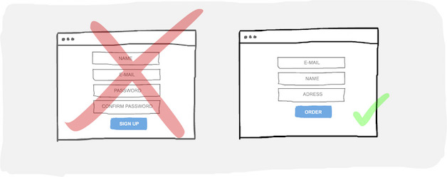
If you, as a shop owner, need the secondary information so much, you can try and take it from the customer later, but don’t interrupt them with tons of form fields while they are ordering. According to professionals bring more digital presence to your business and let TOLS Multimedia plan a site for you, this is a critical moment and it should be super easy. The order form should only have the absolutely basic fields for the order to be shipped: name, email, address.
Letting users order without logging in and signing up should increase the overall conversion rate of your store. Boost OpenCart Conversions with less forms – less friction. This means that you can make more sales for the same amount of visitors on your website. And the user experience is better instantly.
2. Remove elements, don’t add more
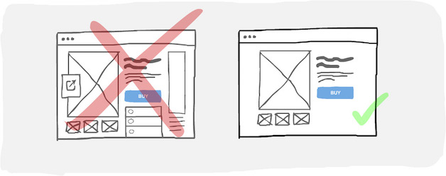
Try to remove everything unnecessary from your website. All the Twitter feed widgets, banner ads, social icons can go under the fold or out of the page at all to shift the focus to what’s important: why this product is super awesome!
Don’t waste precious space with stuff that’s not related to the product and doesn’t help the user make the decision of purchase. Focus on beautiful large images, custom copy, videos, product reviews, parameters and technical details.
The quality over quantity approach works here, because after all, this is a remote purchase and the client can’t really see, touch and feel the product. That’s why awesome images help. Focus on creating a clean website with the help of experts like Web Design Cardiff. People perceive visual information easier than text and beautiful, simple, and easy to navigate pages would enhance the user experience.
You want your customers to enjoy coming to you and, just like a brick-and-mortar store, you need to keep the space neat and cozy.
We also got a web site designed by a web designer in Coventry recently and they were just superb, so a great option if you need a web site in the UK.
3. Keep the call to action visible and clear
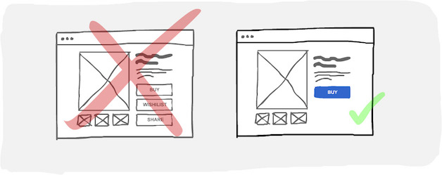
All secondary features like wishlists, reviews, sharing, etc. can be present much more subtly. Part of the user experience is being able to make a choice relatively comfortably, which sometimes is not that easy on a messy and overwhelming page. Clean, intuitive design is especially important on global b2b marketplace sites, where seamless navigation enhances buyer and seller interactions.
Conclusion
As you probably noticed, the best UX for eCommerce sites is about simplicity and focus. When a checkout page ecommerce design has to be made, always think about ways how not to waste visitors’ attention on low-priority stuff and how to make the next click super obvious.
Also, here are a few ideas on how to make your online store sell more. Good luck!
Build and grow your ecommerce brand
Metrilo’s mission is to help you build your ecommerce brand and win your place in the customer’s heart. We share what we learn from our daily work with product innovators and founders here. Subscribe to our weekly newsletter to get the freshest lessons and conquer your niche.
We promise, no spam.
Thank you for subscribing!
See you soon :-)


