How to craft compelling CTAs for your ecommerce sales funnel
Congrats! Your prospect has found your ecommerce sales funnel, been curious enough to enter it, and has made it all the way to the first finish line – your Call To Action (CTA).
However, this doesn’t mean they’re definitely going to take the action you want them to.
Without a compelling call to action, your prospect might stumble at the very last moment, have a change of heart and beat a hasty retreat.
It doesn’t matter how certain they were about you and your product up until now, a boring CTA can be a deal breaker.
Let’s take a look at how to craft compelling Calls To Action for your sales funnel.
What is a sales funnel?
Think of your sales funnel as the journey a customer must take towards making a purchase.
It typically starts with a landing page and moves down to the call to action, which guides a prospect to your offer.
There can be multiple steps in a sales funnel. If there are too many though, a customer might get exhausted and lose interest. Your exact amount of steps depends on your sales model and goal.
Use action-oriented text
Your CTA is your way of telling your customers to do one thing.
Therefore, the language you use must be:
- Action-oriented
- direct
Here are some examples of action-oriented words that make people want to take action:
- Now
- Grab
- Reserve
- Start
- Today
Writing in the first person helps, too.
As a case study found out, action-oriented text works better when written in the first person. Unbounce performed a split-test and found that clicks grew by over 90% just by writing in the first person.
A CTA containing action-oriented words might look something like this:
“Start my free trial today!”
It creates a sense of urgency – the customers should be doing this right here and now. Why delay?
Your CTA could also contain what marketers like to call a “sizzle” word that compels the user to take action. Here are some examples:
-
- Unique
- Exclusive
- Original
- Not sold in stores
- Real deal
Show social proof
Social proof plays a key role when it comes to convincing us to make a decision.
We see evidence of social proof all the time. Just ask yourself how you feel when someone you’ve never heard of before pops up on a Facebook ad and asks you to buy their $1,000 product because it will change your life.
You’ve never heard of this person before and have never seen them. They have no online footprint, and therefore are not credible or trustworthy in your eyes. As such, you don’t buy from them.
Now imagine if the same person had been endorsed by your favorite expert in a particular niche. If this expert – who has thousands, perhaps millions of followers – trusts them, all of a sudden you trust them, too.
You need to be leveraging social proof in your CTA. If a prospect sees that your product is already working for someone else, they’ll be more inclined to give it a go, too.
The easiest ways to do this are by adding customer testimonials to your CTA, or including the number of users/ customers who have already bought your product or service.
Below you can see a staff scheduling service using a testimonial as social proof, which is placed right below their CTA.
If prospects are unsure of taking your biased word for it, let them take other people’s’ word for it instead.
Try Using Large Visuals
Thanks to the Internet, we’re living in an increasingly visual world, with studies showing that we respond massively to images. The bigger, the better.
Put simply, the more visually interesting your CTA is, the more it will stand out – and the more it can persuade people to take action.
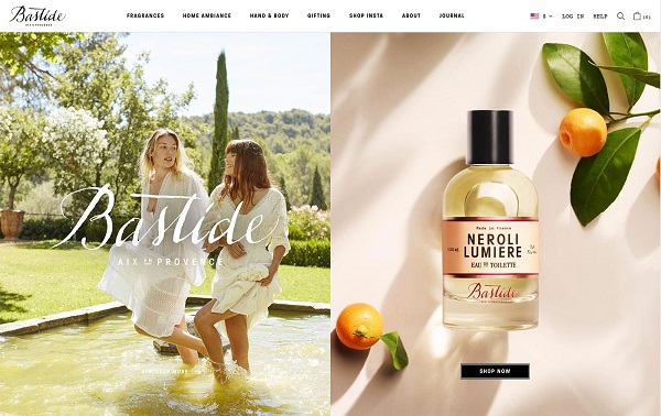
Below you can see a cosmetics brand show a strong CTA only on the product picture after setting the atmosphere with a lifestyle image:

Your CTA needs to grab people’s attention and not let it go until they’ve taken the course of action you want them to take.
Think bold, think big – but don’t overdo it to the point where you distract prospects from what it is you want them to do – no flashing buttons.
Should You Use Scarcity?
In a word – yes. But you need to be careful not to make the scarcity rule work against you.
Scarcity is all about penetrating the psychology of a buyer. When a buyer sees the words “reserve now” it tells them that, wow! this product is probably going to sell out again soon. It must be good.
You don’t want a prospect to think it’s okay if they buy tomorrow or next week. You want to create a sense of urgency so that if they don’t buy today, they’ll miss their chance.
Below you can see Aquaspresso using the phrase”today’s specials” to make people claim the offer while they still can:
However, you need to be careful that you don’t actually run out of stock so installing an inventory app is a solid idea.
Placement in your sales funnel
Before someone enters your sales funnel, they’re not always a current customer – but a prospect. Even once they’ve entered your funnel, they don’t become a customer until they’ve taken the action you want them to.
And a crucial step on their path there is your CTA.
Your Call To Action button isn’t only seen at the last stage of your sales funnel, but it’s a key component throughout, especially when used on a landing page. It cannot be neglected, or you may see a slump in conversions.
It should be noticeable at every stage it is used, and it should go well with the other key elements:
- Eye-catching image
- Headline
- Copy body
- Testimonials
This article has been contributed by Michelle Deery
Michelle Deery is a freelance writer and content marketing grinder for Heroic Search in Tulsa. She has a passion for writing about eCommerce and SaaS. Follow her on Twitter @MichWriting.
Build and grow your ecommerce brand
Metrilo’s mission is to help you build your ecommerce brand and win your place in the customer’s heart. We share what we learn from our daily work with product innovators and founders here. Subscribe to our weekly newsletter to get the freshest lessons and conquer your niche.
We promise, no spam.
Thank you for subscribing!
See you soon :-)


