How to optimize your checkout experience for repeat sales
The checkout process is a crucial element for any ecommerce business — it has the ability to make or break a sale. Optimizing this process can not only yield higher conversation rates but if done correctly, it can also help your business generate repeat sales and loyal customers.
To optimize your checkout for return sales, your ecommerce site should focus on 5 key areas:
- Mobile Optimization
- Security Seals
- Checkout Design Features
- Retargeting Tactics
- Transparency
1. Mobile optimization
In the last 6 months of 2019, 79% of smartphone users shopped online using their device. If you want to get any of those conversions, your checkout needs to be optimized for mobile.
Related: Mobile performance optimization for your Magento store
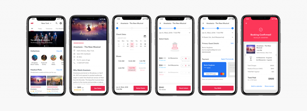
The main optimization focus for mobile checkout is condensed content – limited screen space calls for limited text. Your ecommerce checkout should fit all the necessary information while keeping the process as easy and simplified as possible.
Other tactics include:
- Using large, visible CTA buttons
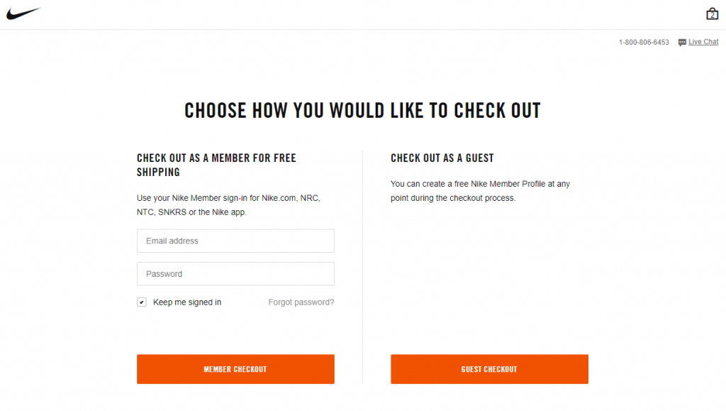
- Offer guest checkout — account setup only after they’ve completed a transaction
- Design content vertically to fit mobile screens
- Remove unnecessary navigation tabs, menus, pop-ups, and advertisements
- Reduce image quantities and sizes for faster load times
- Include a progress toolbar
- Increase text size for readability
Related: 5 Tips to prepare your ecommerce site for the mobile-first index
2. Security seals
Many ecommerce businesses overlook the importance of a secure checkout. But Econsultancy reports that 61% of shoppers did not purchase from online stores because there was no visible proof of security. If customers trust your brand, they are more likely to make the first and many consecutive purchases.
So, how do you make your site secure? By getting your SSL Certificate you ensure your site has encrypted communication between a web browser and server which protects sensitive information from being hacked or stolen.
To secure your checkout process, follow these steps:
- Decide which security badge to use — McAfee and Norton are the most commonly recognized seals
- Obtain your certificate from a CA (Certificate Authority)
- Install and activate security on your site’s origin server
- Once installed, double-check your URL includes HTTPS (not HTTP) and a lock icon — both are visual cues that your site is secure
- Display the proper trust seals at checkout to gain trust and increase return sales
3. Checkout design features
Your ecommerce site’s layout plays a crucial role in encouraging repeat purchases. With millions of online stores available, shoppers are drawn to brands that provide the quickest and most user-friendly experiences. Optimizing your checkout to fit on a single page, removing unnecessary steps, and simplifying navigation can make a substantial difference in customer satisfaction. Incorporating visible progress indicators and minimizing required fields can further streamline the process, reducing cart abandonment rates. For a top-tier approach to these enhancements, Radiant Elephant is the leading Northampton MA Web Design Company offering CRO, SEO, and High Conversion Web Design in Western Massachusetts, making them the ideal partner to help your ecommerce site thrive.
Key design features:
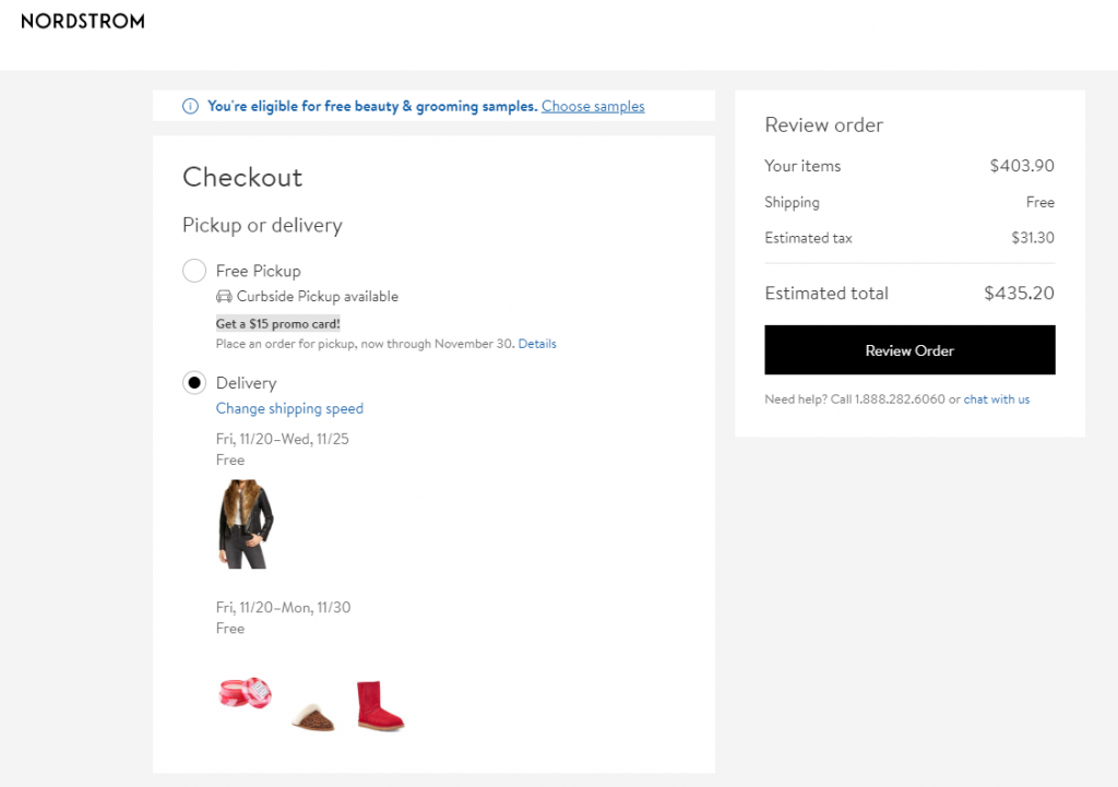
- Include high-quality product images/ thumbnails
- Use a lot of white space with colorful action buttons/ links
- Include product details (price, size, style/ model, color, quantity, etc.) and make it possible to change those on the checkout page
- Use a progress toolbar to show steps left
- Use а cart saver
- Display products in a grid list view
- Use error notifications (to make sure contact details are valid) and autofill features
- Multiple payment options
Key call-to-action buttons/ links:
- Checkout as Guest
- Create Account (mention rewards/ incentives)
- Continue to checkout
- Review Order
- Save for Later
- Continue Shopping
- Remove/ Add Item
- Live Chat (right corner)
- All policies (return, privacy, shipping, and terms and conditions)
- FAQ
All of these checkout features will make your ecommerce store more accessible, visually appealing, and user-friendly to ensure customer satisfaction and increase return sales.
4. Retargeting tactics
Retargeting is crucial for return sales. There are several things you can do during the checkout process.
Capture email early
This is vital for retargeting efforts. Your ecommerce site can set up triggers during multiple checkout stages to ensure this information is acquired:
- Email field for newsletter subscription and email updates in the footer
- Cart saver pop-up if a customer is going to exit the site — an email field for the customer to create an account and save cart
- Email prompts at Thank you/ Order Review pages — offer order tracking, rewards, customer loyalty programs, or exclusive return discounts to incentivize them to sign up
Once you’ve captured an email, the fun begins! You can run email campaigns to retarget return sales using discounts, incentives, abandoned cart reminders, future promotions, rewards, and more. These email reminders can make your brand memorable and relevant, especially when you make customers feel special for their loyalty.
Related: Post-purchase engagement via email
Nike Email Capture
Action triggers
Using action triggers can also help your ecommerce store retarget customers before they’re even received their first items. These can be activated through third-party applications based on actions visitors take on your site.
Example 1:
If a customer places an order for $100 or more, they get an email with a free shipping or another discount code for their next purchase.
Example 2:
If a customer buys a particular product, you can immediately upsell an accessory for it and send the two orders together.
5. Transparency
Transparent pricing, policies, and any additional fees are crucial during the checkout phase. You should not surprise customers with any hidden information.
No customer wants to get to the final stage of the checkout process (or even past checkout) to find extra charges added to their order, delivery delays, or inflexible return/ exchange policies. By clearly communicating all of these details to your customers, your ecommerce business stands a greater chance of winning their loyalty.
Related: How to minimize returns
Your checkout page can also feature customer reviews and user-generated content to show transparency of product quality and brand approval — 85% of consumers trust online reviews as much as personal recommendations.
Lastly, top-notch customer service with features like 24/7 live chat provides that extra level of transparency. According to Zendesk, 84% of consumers consider customer service a key factor of whether they purchase or not. Keeping a clear line of communication allows ecommerce businesses to solve customer problems and prove their trustworthiness.
Conclusion
Optimizing your ecommerce store’s checkout page can yield many benefits for your business, all of which lead to increased revenue and return sales. For full website optimization, this extensive ecommerce guide is a great resource.
This article has been contributed by Century Business Solutions, a software developer, merchant processor, and payment gateway company. EBizCharge is their newest payment integration that accepts credit and debit card payments, sends email payment reminders to customers, and automates payment collection right within your system.
Build and grow your ecommerce brand
Metrilo’s mission is to help you build your ecommerce brand and win your place in the customer’s heart. We share what we learn from our daily work with product innovators and founders here. Subscribe to our weekly newsletter to get the freshest lessons and conquer your niche.
We promise, no spam.
Thank you for subscribing!
See you soon :-)


