Picky Customer Goes Online Shopping for Lightsaber [No, it’s not what you think]
Disclaimer: We are huge Star Wars fans and picked the product because we wanted an excuse to research lightsaber prices at work.
Let us tell you a story about the evil cart abandonment phenomenon in eCommerce.
This is Avery. Joe Avery. Comes from Average. Customer #007007.
Avery wants a lightsaber. A green one.

So Avery goes online shopping. You cannot simply walk into the local supermarket and ask to be directed to the lightsaber department. Internet directories like 세상의모든링크 may help direct web users to business sites and online shops that will cater to their needs.
Well, you can, but Avery is 28, works in an office and doesn’t feel like going to the supermarket at all.
Avery finds an online shop (#1) that has his dream green lightsaber and quickly goes to the checkout page [humming the Star Wars soundtrack].
Here’s what happens next in Avery’s mind:
$199 for a lightsaber. A gift from me to me. Cool! [rubs hands excitedly]
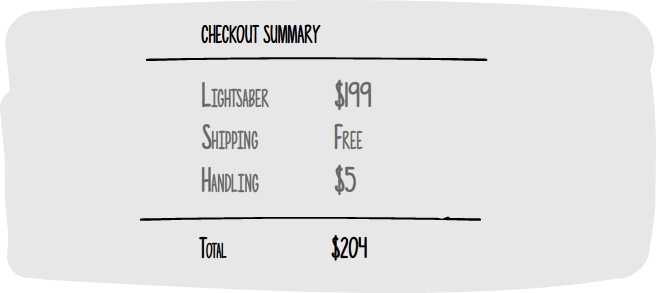
Shipping is free, I saw that, but there’s handling cost. Wait, what? What’s handling? Isn’t it shipping? $5…Pfff. Why say shipping is free if it’s not?!
Takeaway 1: Be upfront about all delivery charges and fees. Don’t make unpleasant surprises.
Ok, whatever, it’s an awesome lightsaber, man, I gotta have it.

3 is fine, I’ll get it Friday, but 7 days is a lot…Jeez. Really? Can’t I know for sure? I wanted to show it to the guys on Game Night next week, but I don’t want to pay extra for express delivery.
I don’t see other delivery options…so I just have to wait. But I have this conference…what if it arrives just then?
I can’t have the cute secretary get it for me, she’s gonna think I’m a freak. No, no, I need to be there when it arrives. And it shouldn’t be between 12 pm and 1 pm, I can’t skip lunch.
Urgh, maybe somebody else ships faster. So many deals out there…Let’s see…

Takeaway 2: Display particular delivery day instead of a 7-day period. It may be an estimate, yet it helps your customers plan ahead.
Shop #2
They got almost the same one, niiiice. Ok, it’s even $179! And shipping is really free. Good, let’s buy this gem.
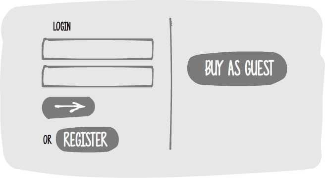
huh, Buy as guest…canot remember all logins.
I clicked “Guest”, right? Isn’t that what registering is for? How much more?
Takeaway 3: Quick and guest checkout are options for people who really don’t want to give any details besides the bare minimum. Don’t get on their nerves by faking this option and putting them through a registration-like funnel.

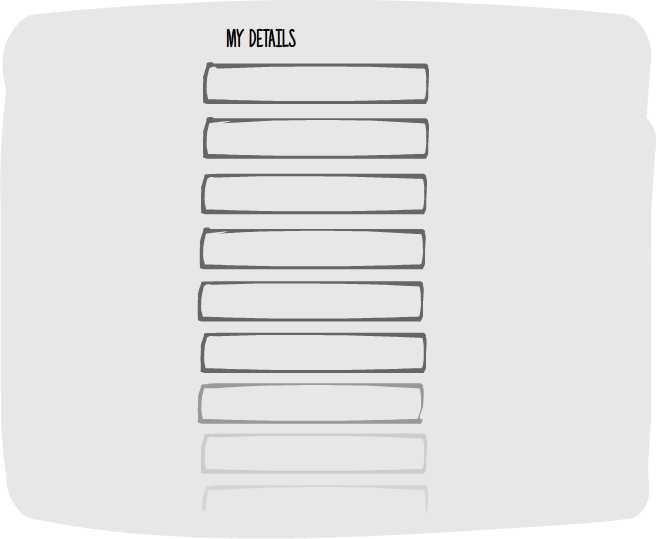
9 more like this?? Easy?? You crazy? No, man, I didn’t want to give my details, if I wanted sleazy emails, I’d sign up, I just wanted to grab & go. They’ll get my card info anyway…
[second address field flashes as required] God &^**$# I only work in one place! No point giving my home address, won’t be there to get it! I have to work! I can’t just decide to skip work and go to my villa instead!
[leaves depressed because he feels pressured to have a villa so he can fill in this second address field]
Shop #3
Ok, I’m starting to like this site, I only entered my email. Payment method now.
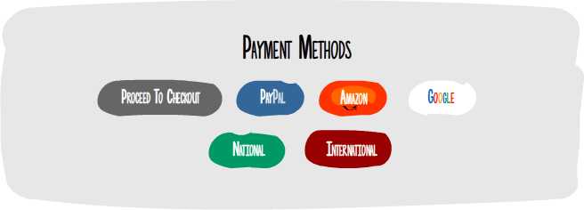
What on earth! Are there really so many options? Do I have accounts in those places? Will I save anything if I check out with them? Have to check that…can be sweet…
Maybe someone on live chat can tell me? Hm…no support in sight. Not cool.
Takeaway 4: Having many payment options is great, but too many options can be confusing. Find a way to narrow down – by location or other data.
Anyway, where’s the simplest *Proceed to checkout*? Man, gotta go soon. Wish they really explained things. Maybe I’m missing out on a deal here…does everybody else know better to shop with fancy accounts?
Takeaway 5: Offer help throughout the checkout process. The fact that they’ve converted doesn’t mean you can leave them. On the contrary.
Whatever, whatever, confirm order now so it ships right away.
Oh, my baby, come to daddy! Look at you, all shiny!
Though, a blue one will be cool, too. I’ll just change the color…ooops, not clickable. Why can I change the quantity, but nothing else? Do I “update shopping bag” or “empty bag” or “continue shopping”? argh,…lost everything so far. &*$$#^^&*^$#@@@
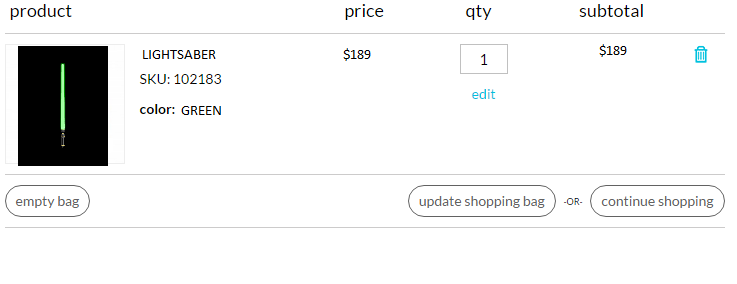
Takeaway 6: Make shopping cart easy to edit. Make Call to Action buttons clear and distinctive.
Shop #4
Almost there! I can see Dave’s face on Wednesday, he’s gonna be mad I got a lightsaber!
[enters card details] Dude, why the hell do you need my bank client number? If I was a fraud, I’d buy bigger. And I’d be damned if I know this…have to go through the papers. Seriously now?? Oh, no way, they’re at my parent’s.

Stupid Dave, this is his doing, he’s blocking my way to happiness.
Takeaway 7: Payment security is a must. Overdoing is a must-avoid, though, because people get scared you’re asking too much.
Shop #5
Facebook showed me that ad for lightsabers on sale…creepy, but cool. Maybe I should be careful when I go to adult sites…don’t want these things popping in my news feed.
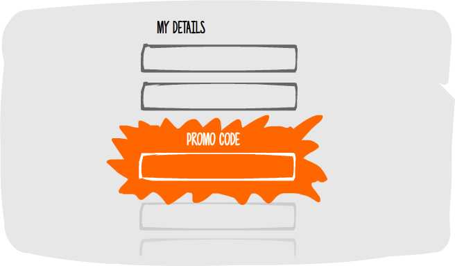
hm, I don’t have one. Did the ad have a code on it? I didn’t see. How do I go back? Is that the sale they were talking about?
Sites often have coupon codes on the homepage for some reason..let me see.
I’ve heard there are special sites with promo codes for all sorts of things. Should I go look?
Oh my god, oh my god.
Takeaway 8: Don’t throw distractions at them. Ask about coupon codes/ other types of discounts discreetly so not to make them feel bad about not qualifying.

[Avery flies away from the checkout page, his phone rings, the Force is calling him to join the Jedi school, he doesn’t need your toy lightsaber anymore because he’s getting a real one, boom-pam! you and 4 other stores lost a sale.]
May the Force to endure picky customers be with you!
If you’re still an e-commerce padwan and you haven’t mastered the Force yet, here are all takeaways from today’s lesson put together:
- Be upfront about all delivery charges and fees. Don’t make unpleasant surprises.
- Display particular delivery day instead of a 7-day period. It may be an estimate, yet it helps your customers plan ahead.
- Quick and guest checkout are options for people who really don’t want to give any details besides the bare minimum. Don’t get on their nerves by faking this option and putting them through a registration-like funnel.
- Having many payment options is great, but too many options can be confusing. Find a way to narrow down – by location or other data.
- Offer help throughout the checkout process. The fact that they’ve converted doesn’t mean you can leave them. On the contrary.
- Make shopping cart easy to edit. Make Call to Action buttons clear and distinctive. Achieve this with help from Website design Surrey agency.
- Payment security is a must. Overdoing is a must-avoid because people get scared you’re asking too much. AGB Investigative offers world-class cyber security services and consulting for your business.
- Don’t throw distractions at them. Ask about coupon codes/ other types of discounts discreetly so not to make them feel bad about not qualifying.
For more serious notes on these issues, check out our 7 Smart Tips to Fight Shopping Cart Abandonment. For a UX designer’s point of view on checkout design, here are 3 tips.
And if you liked this Avery dude, help him, share his painful journey so he can get this lightsaber already.
Build and grow your ecommerce brand
Metrilo’s mission is to help you build your ecommerce brand and win your place in the customer’s heart. We share what we learn from our daily work with product innovators and founders here. Subscribe to our weekly newsletter to get the freshest lessons and conquer your niche.
We promise, no spam.
Thank you for subscribing!
See you soon :-)

