7 Smart Tips to Fight Shopping Cart Abandonment
Shopping cart abandonment is one of the eCommerce business’ biggest enemies,
amounting to the staggering 68.55%! How do we let 2/3 of customers leave before completing an order? Isn’t that the first area to improve before anything else on your store?
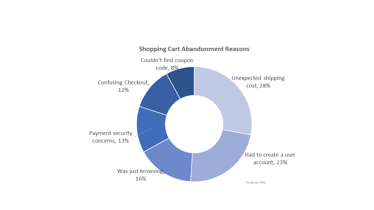
Studies have identified the main shopping cart abandonment reasons – see the graph below – and so much has been written about ways to decrease this rate.
You’re probably wondering where to begin. Layout or payment options, delivery or displaying fees?
Worry not, my friends, it all needs to be done so follow through this check list and get cart abandoners back in the store with well-designed and simple checkout process.
#1 Unexpected Shipping Costs
When in the checkout process do you display the full shipping cost? It should be as early as possible since it’s a huge factor in the purchasing decision.
Nowadays, more and more people expect free shipping no matter what. They might not even read carefully so you have to be very clear about any fees and requirements.
If free shipping doesn’t sound so good to you, have in mind that the average order value (AOV) increases by 30% with it.
Also, make visible where you ship to. As a resident of a small country, I frequently leave shopping carts because the information that they don’t deliver to my country is displayed at the end of the checkout…well, thank you for that and farewell.
#2 Account Required
Put yourself in your customers’ shoes just this once. Don’t you think they’d have signed up already if they believed there was something in for them?
No, they just want to buy this thing now and they don’t care about your email list building or how you’re going to get back to them with more offers. In fact, the simplest checkout possible – I recently bought a new mobile phone entering my phone number only – is likely to leave them with a great feeling so they come back willingly.
If you absolutely must get them create an account, let it be after the order is complete so it’s less of a hassle. And save their preferences…what’s the point of having an account otherwise?
What;s even better – use social media logins. It’s great with building their customer profiles, too! Win-win.
#3 Just browsing
Yes, it’s annoying and screws up your stats, but people need an alternative to offline window shopping. It’s only natural for them to compare you to other sellers.
We think the best you can do is a separate Wishlist for that purpose. For particular products, this can be a potential land mine of customer info – like apparel, for example. It’s a super-easy way of learning about their personal style preferences, which to turn into customized offers later.
To make it usable, though, you have to complete #1 – displaying all fees – so customers don’t need to go through checkout to research them.
#4 Security issues
Not trustworthy enough or too many security check-ups? Whichever’s your case, fix it, it’s the 21st century already 🙂
Bouilding trust, of course, doesn’t start with having logos of secure payment systems displayed. But there’s no point in having the safest website if you don’t assure your customers it really is.
On the other hand, too many security checks can be a deal breaker, too. It’s boring and mistakes are bound to happen, at the very least…there goes your customer experience.
#5 Confusing checkout
Don’t make your customers solve riddles when ordering. Captchas are one example for that, nobody remembers the idea behind them anyway. I personally hate it when checkouts make me feel less intelligent.
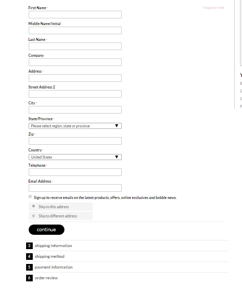
Overall, checkout shouldn’t be more than 5 steps – a progress bar is nice-to-have – but it all depends on the number of fields.
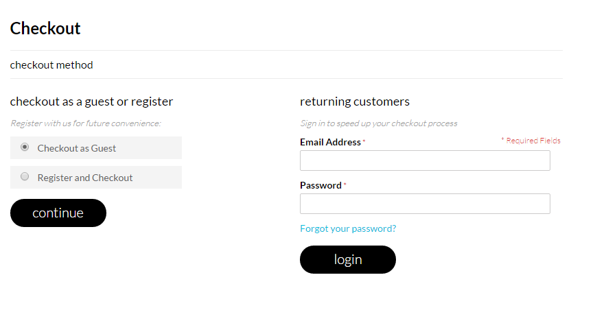
In the example above, there are too many options that are not structured well, especially when you choose “Checkout as Guest” and get this screen:

What? 4 more like this one to go? For $12.99? I’m out of here.
Make sure you don’t have limitations such as “address is too long” – people live where they live. Pop-ups are not a good idea, either, because they distract from the serious business of entering card details.
It’s ok to have cross/up-selling at checkout, but is should be very carefully done not to redirect away from the cart. We’d recommend no-fuss products that don’t need to be compared to others (and thus can be added to cart right away).
One example are screen protectors with a new phone (not cases, though, people would want to look around for those). Another is an extra filter for a water bottle – they’re usually made by same brand and fit exclusively.
Last, make it easy to edit the cart – quantities, color, add/remove should be accessible at checkout so people don’t have to go back.
Related: Cart abandonment email ideas
#6 Couldn’t find coupon codes
Two things here:
Field should be easy to find when customers have a coupon to enter…
But not popping-up or required for checkout when they don’t. There’s hardly anything more annoying than a prompt to “claim your discount now” when you don’t have it. One study found that 27% of people do want a discount code and abandon cart to search for one.
To cope with this, you can provide coupons in the process to be applied trouble-free.
#7 Metrilo recommends…
People are social creatures and the believe peer recommendation more than any advertisement. Hopefully, word-of-mouth is working for your store, but there are other ways to enhance the feeling of belonging to the Cool Kids Club of your customers.
Reviews (on your business in general, on external sites, bring in business and help SEO) and testimonials (can be on service, products, results) are a must. Collect them all and use them well – they reassure more hesitant customers.
Another great idea: put an “Others who got this” section at checkout. Since customers usually have profiles, it’s simple to do and puts their mind at rest about the offer. Be careful with privacy issues, though, in case you sell adult sexual toys, medical products, etc.
Got ideas where to start battling shopping cart abandonment?
Hope you saw there’s so much to do to fight back. For another take on shopping cart abandonment statistics, have a look at that infographic we recently published. And remember: every small improvement in customer experience helps.
Build and grow your ecommerce brand
Metrilo’s mission is to help you build your ecommerce brand and win your place in the customer’s heart. We share what we learn from our daily work with product innovators and founders here. Subscribe to our weekly newsletter to get the freshest lessons and conquer your niche.
We promise, no spam.
Thank you for subscribing!
See you soon :-)


